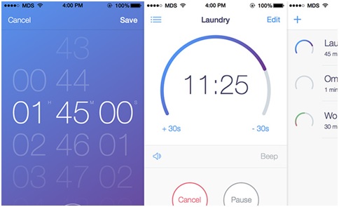
The year 2015 witnessed some groundbreaking revolution regarding app design. Last year was the year of new-age minimalistic app design. Mobile application, which started off as an add-on service long ago is now focusing on the customized design so as to drive business through it. This is the reason why mobile app designers are focusing more on enhancing UX with some cutting-edge designs.
Now that 2016 is halfway already, plenty of changes are expected on the mobile application design front. New trends will set, current benchmarks will rise, and design innovations shall flourish again. So for all those design fanatics out there, let’s dig deep into what lies ahead for us in 2016.
- Make way for skeuomorphism
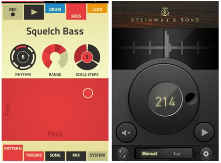
Yes, we are back to where we started the app design during the initial stages of mobile app development. The skeuomorphic design is all set to make its way back in 2016 with the innovation in the UI front. Instead of texts and buttons, the real-world simulation creates mobile applications at home. Some of the intriguing iOS app development had let people drink coke through a smartphone, and a few of the innovations in Android app development have led people to pull the strings of the guitar through a mobile app.
Till now, this was incorporated into fun and leisure apps like guitar simulation with strings that play with the app, keyboard player with keys, mike for the voice recorder, etc. However, this vintage design is now set to make an entry in a more productive way than ever.
- Flat 2.0 to gain popularity
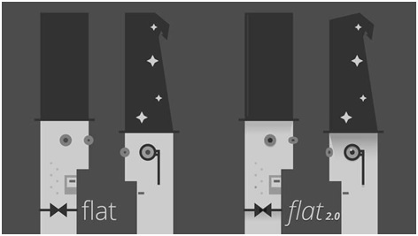
While skeuomorphic design undergoes experimentation, flat design will still be ruling this year in mobile apps with innovations in Flat 2.0. Designers can avail two benefits by using flat design; one is by enhancing UX by cutting down the load time as flat designs weigh less, and the second – setting up a style quotient. Plenty of innovations are expected in the flat designs as well by incorporating Flat 2.0 in mobile apps.
This is very crucial in giving a sense of depth to the app images. Designers have much work to do this year with Google’s new design language called Material Design for the same.
- Typography innovations
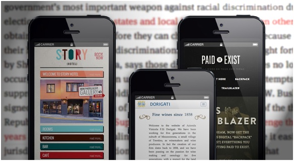
If there is one way to impress users with your uber-cool app, it is by innovating new typographies. Typography is a significant design element to appeal to the design intellect of your audiences through the creative integration of technology and usability. Deploying elegant and clean typography not only enhances the reading experience but it also creates a brand image.
Now with Google fonts, innovations in typography are bound to come in the form of large font sizes, italics, and typefaces. Also, there is a sample amount of scope for calligraphic typography as well.
- Cool Colors to flow more
This generation is practically ‘done’ with the gradients and loud colors. Now is the time to incorporate pure, cool colors, to blend with app design. Colors not only include font colors or menu bars but overall app color which defines a brand. Like, if you try to associate the word ‘Twitter’ with color, one is bound to think of a cool sky blue color.
The reason is that when a designer codes color for an app, they are also designing a brand recall tool. Symmetric use of fresh colors becomes easy on the eyes and, therefore, avoids any hurdle for users if they are using it for a long time.
- Blur backgrounds
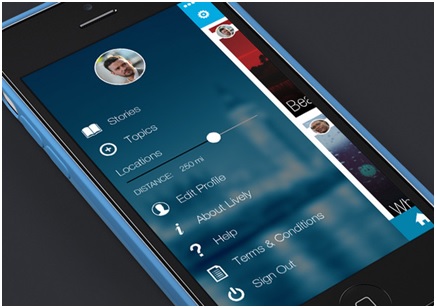
One of the most beautiful design innovations regarding application UI is the integration of blurred background effects. Diffused backgrounds are yet to make a successful entry in the mobile application. The beauty lies in displaying a Call to Action above the blurred background which in turn contributes positively to UI.
- Minimalistic Design
Gone are the days when Mobile application developers sit for long hours to make sophisticated, texture-rich designs for mobile applications. The drift toward minimal design is somewhat visible in website designs, and now the same is set to make way for the mobile applications coming year.
Sure, a few of these design modernisms are already rolling in some or the other way in mobile applications. However, this year, such changes are expected to set new benchmarks in design standards. New rules will engrave in the app design industry through pathbreaking mobile app designs for improving UX at every stage of app navigation. For now, all we can do is wait for the best mobile app development companies and app designers around the globe to create stunning UX in the coming days.
Author Bio:
ShahidAbbasi is a big-time tech geek working with one of the best mobile app development companies, Peerbits. He has proven efficiency in designing mobile apps for the enhanced UI/UX for websites and mobile apps. Moreover, he likes to share his knowledge over a series of technical blogs to make himself more resourceful globally. Over the weekends, he transforms himself into becoming an awesome cook.
Magento Development | PSD To Magento | Magento Theme Development | Magento Development Services

